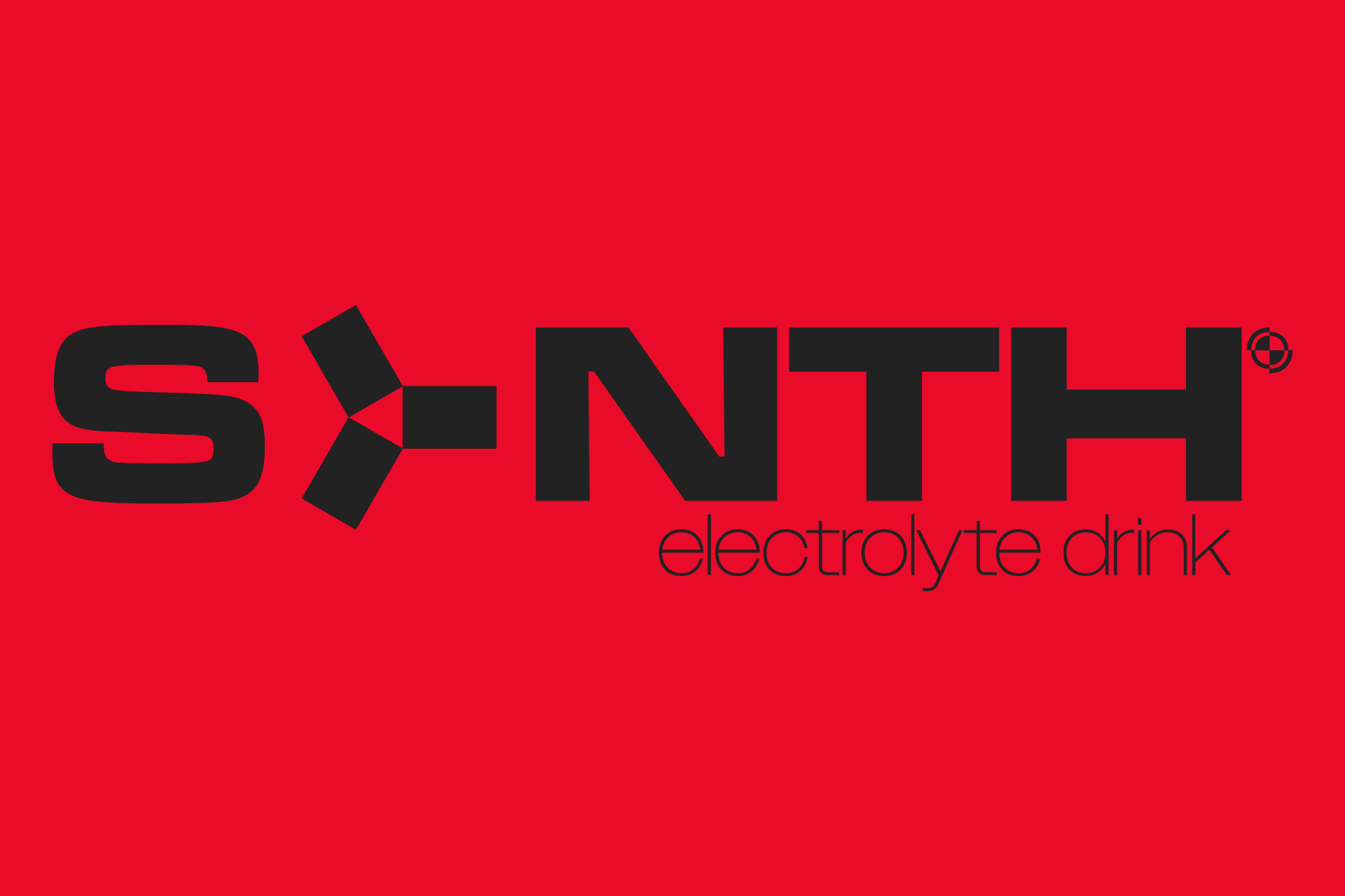
with SYNTH the goal was to create a comprehensive brand for an electrolyte drink
marketed intentionally at recovery outside of high intensity athletics
(for example at a concert, or the morning after a concert)
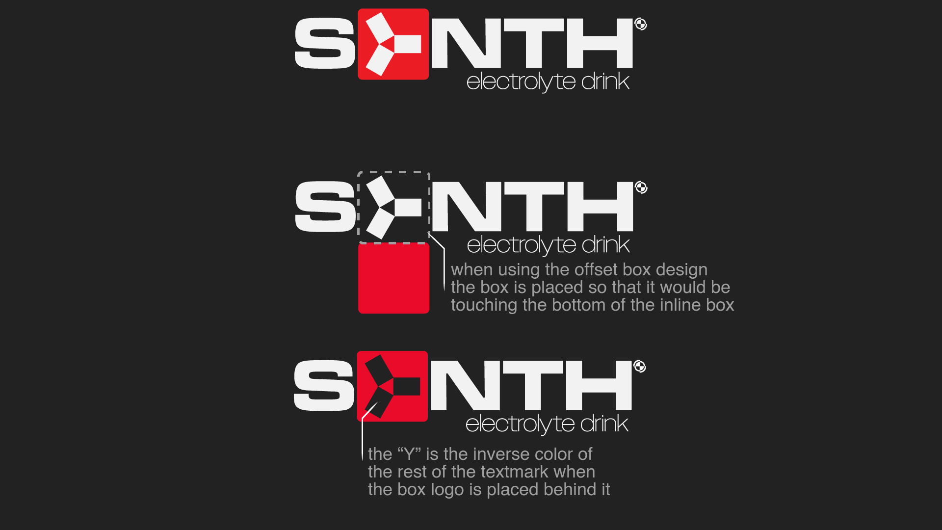
one of the earliest choices was to present the "Y" in the name
as three equidistant wings, sharing the 120° degree separation
seen in salt crystals molecular structure when viewed from
an isometric perspective as sodium is a major electrolyte in recovery drinks

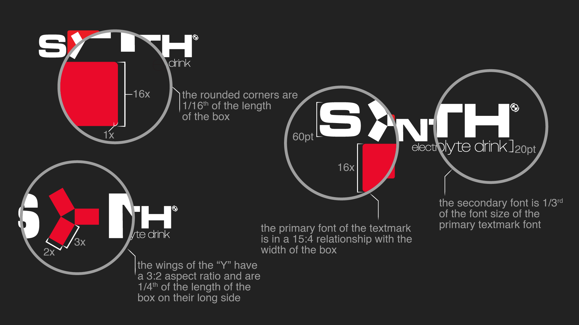
it was easy to rule out fonts that didn't match the futuristic industrial
look of the brand, much more difficult however was deciding what
font went best with the logo, ultimately deciding to go with the
bold option from the Microgramma family for the textmark

once the primary font was chosen the "Y" was integrated.
the secondary font was much easier to choose,
ultimately deciding on Owners Wide Extra Light to give a more
delicate and rounded design to contrast with the very
square visuals of the primary textmark.
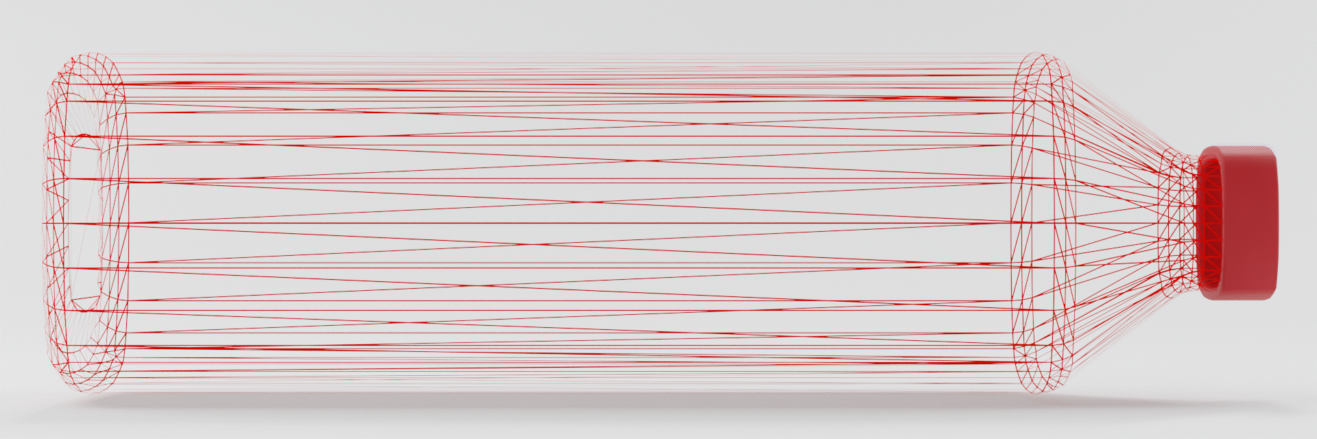
from the outset it was the plan to use bottles similar
to ones that already exist on the market, luckily that made
creating digital mock-ups as simple as measuring an
off the shelf product and modelling a matching virtual counterpart.
of course making this mock-up included modularization to ensure
that potential future branding changes could be integrated seamlessly.